
7. Knowledgebase
The Knowledgebase serves as a comprehensive user manual, offering quick access to detailed guides and instructions for various features and functionalities. Clicking on a Knowledgebase link will take you directly to the relevant user manual content, providing step-by-step assistance and information to help you navigate and utilize the system effectively.
8. Widgets
The Dashboard Layout component is provided with dragging functionality to drag and reorder the panels within the layout. Click on the settings icon on the right side top corner to perform the following actions in the dashboard.
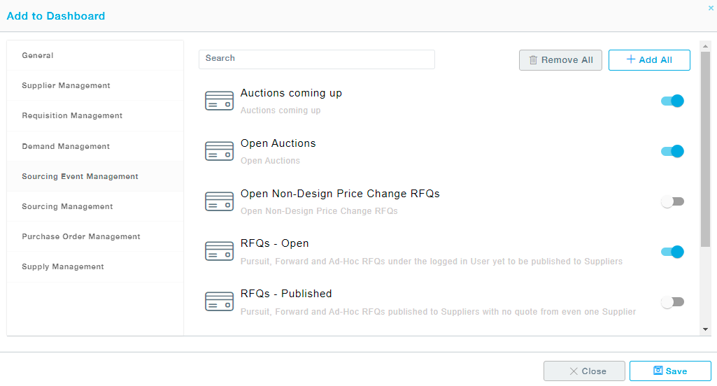
Customize Widgets: All the charts and representative cards are arranged module-wise. Select a module from the available module list to view the collection of cards and charts available. Choose the charts/cards and click on the Save button to move the selected items to the dashboard. The icons represent the type of dashboard item, whether a card or a chart, if it’s a chart what kind of chart, for instance, a bar chart, line chart, pie chart, etc.
Remove All to deselect all the charts/cards from the dashboard. Add All button will add all the charts/cards under the selected module to the dashboard.
Period: Choose Trailing 12 Months to view all the transactions during the last 12 months. Choose the Calendar Year to view the transaction from 1St January till the current date.
Remove All: Removes all the charts/cards from the dashboard.
Drag and drop the cards across the dashboard region as you desire and to move charts click on the title bar and drag to the desired location.
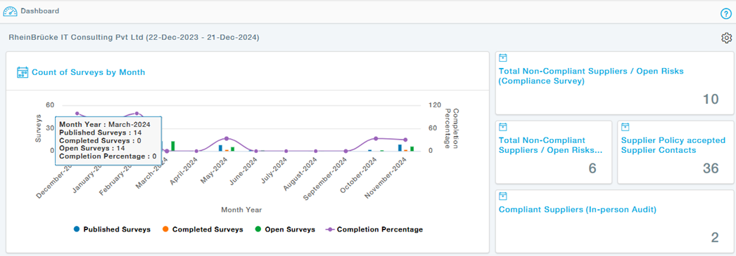
Representative Visuals
Here are some representative Visuals. The Titles and the Legends at the bottom of the Visuals are self-explanatory in most of the cases, if you understand the Business context.
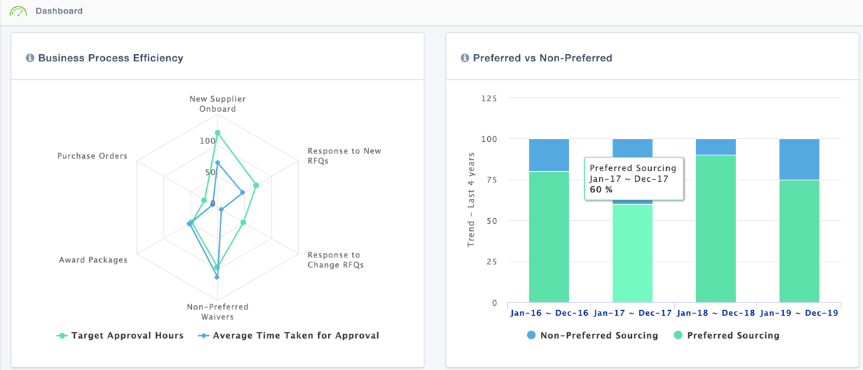
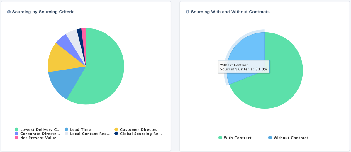
Actions
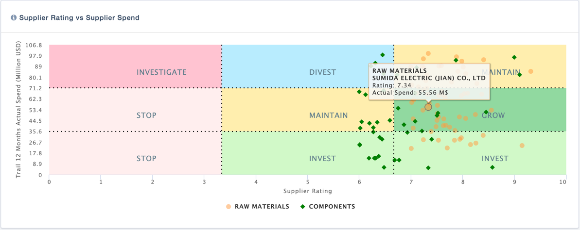
When the User hover over a component of a Visual such as pie or a bar or a point, if the mouse cursor turns to a hand cursor, it means the component can be clicked to see more detailed information.
Such detailed Information can be in the form of a drilled down Visual or a list of information in the form of a table.
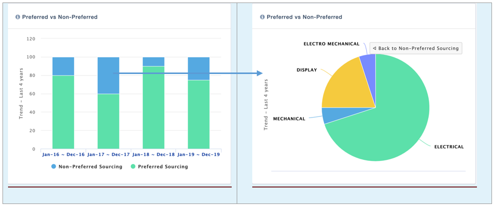
For example, clicking on the part of a Bar in the below Visual, opens up a Pie with the details of the selected Bar.
Representative Cards
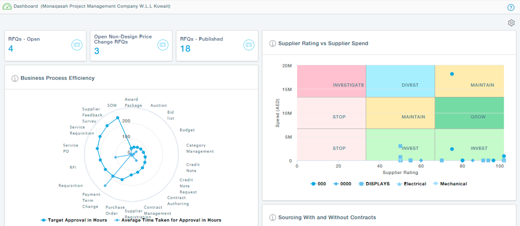
In addition to Visuals, the Dashboard also carries a number of cards which indicate the count of key metrics, actions, reminders etc. They are grouped under different groups such as My Sourcing Information, My Suppliers, My Actions etc.
Each of these groups carry a number of Cards indicating some key information.
Here are some examples of such Cards
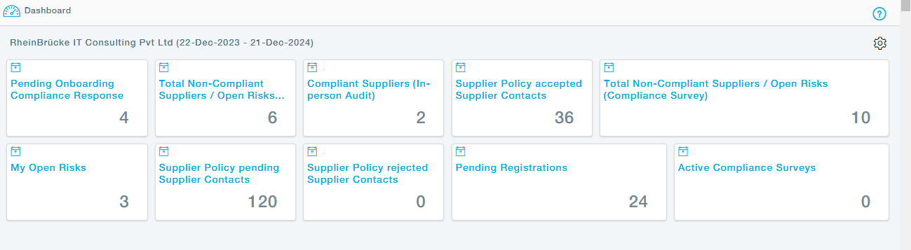
The Title of every Card is self-explanatory to understand what the number in the card indicates.
Actions
When the User hover over a card, if the mouse cursor turns to a hand cursor, it means the card can be clicked to see list of details related to the count. For example, clicking on the number 3 in the Open Auctions card takes the User to the list of open Auctions under the Auction Management function.
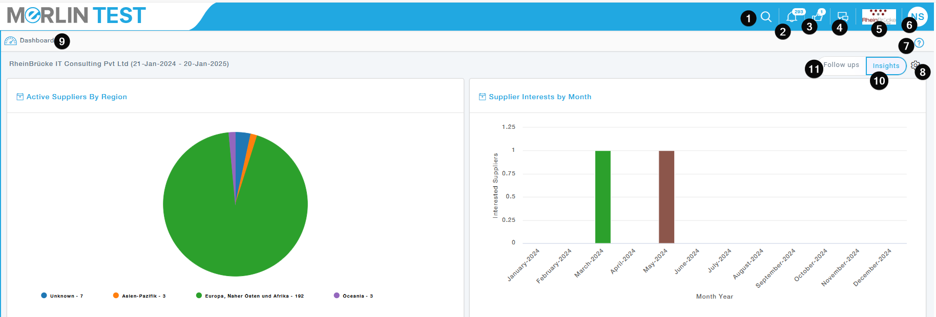
9. Dashboard
A dashboard is a centralized interface that displays key information and metrics, typically tailored to the user’s role or preferences. It offers a snapshot of important data, enabling quick decision-making and efficient task management.
10. Insights
The Insights tab will provide the overview of the dashboard page, ie the current page as shown below
11. Follow Ups
Ability to check the follow-ups on the landing page where the buyer can check all open items like open invites, pending registrations, with the possibility to filter on supplier.
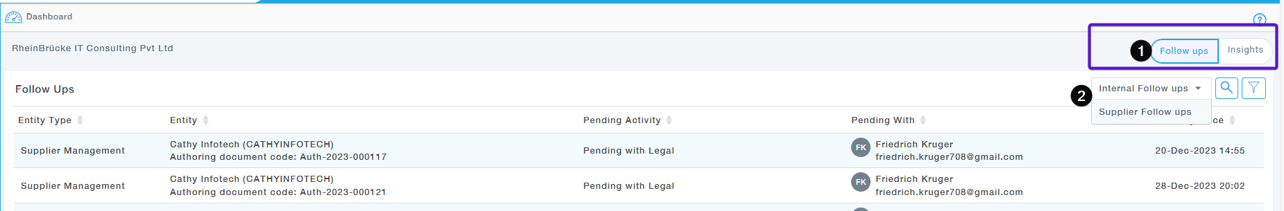
Click on Follow-Ups under the Landing Page. View the List of Follow-ups along with the “Pending With” User and “Pending Since” Time. Internal Follow ups are pending with Buyer Portal users and Supplier Follow ups are pending with Supplier Users
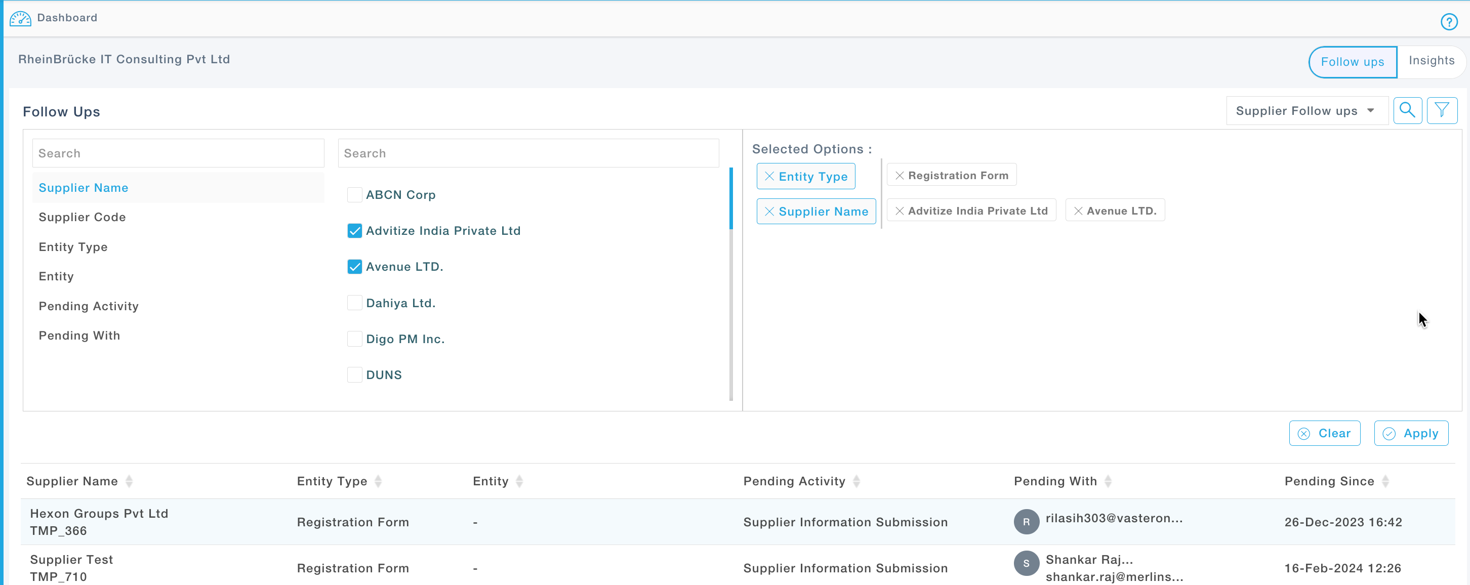
Use Filter to filter data based on the Business process Type, Supplier etc.